In August last year, the Lowy Institute launched our flagship Pacific research project, the Pacific Aid Map. Foreign aid is an important resource flow for many parts of the Pacific, making up 7% of regional GDP. Leaving out Fiji and Papua New Guinea, this number shoots up to 27%. But the world of foreign aid is a murky one, with a lack of transparency hampering aid in a number of ways. The Pacific Aid Map was designed to help fill this transparency gap and improve the efficiency of aid allocation and its overall effectiveness.
A year on, we are confident that it is achieving that objective, and we are delighted to release a second-year update that makes the data richer, updates it for another calendar year, and incorporates some new tools for users into the online interface.
So, what’s new in this year’s edition?
New and more granular data
The 2019 update includes a whole new year of data. We now have comprehensive data from all donors from the years 2011 to 2017. From some donors, we have data up to 2018, and in a few cases even 2019. Unfortunately, the 18-month lag for most donors to publicly report properly audited data remains frustratingly stubborn.
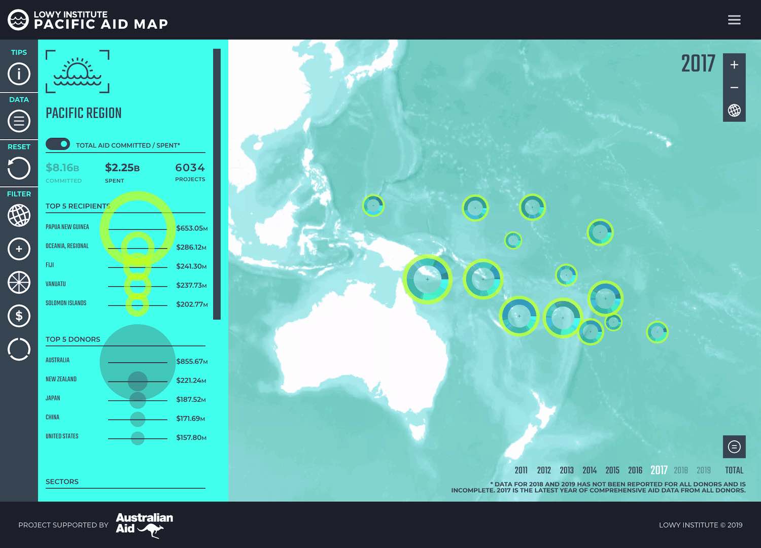
At the macro level, we see a bounce-back of aid to the region in 2017, after a drop in 2016, reaching almost exactly its seven-year average at $2.246 billion, an increase of $243 million from the previous year. However, while aid flows have normalised, they have still shrunk as a proportion of regional GDP, dropping from 8.7% in 2011 to 7% in 2017. Adjusting for inflation aid to the Pacific has also dropped by 9% in real terms over the same period.
Aid is also becoming less generous, with a increased share of the aid mix made up by concessional loans. In 2011, lending made up 7% of all captured financial flows to the Pacific. In 2017, that number had jumped to 16%. Debt dynamics in the Pacific will be the subject of a coming Lowy Institute report that draws extensively on Pacific Aid Map data.
The update also includes more granularity in the data. Last year, we collected information on 13,000 projects. This year, we have more than 20,000 projects. Now that we have a completed product, we have much more buy-in from donors in the region who are eager to correct and fill out the data more comprehensively.
We have also begun to incorporate new types of official financial flows that go beyond the confines of traditional foreign aid. There a number of ways in which governments as donors invest in the security and prosperity of the Pacific that, by OECD definition, do not meet the definition of aid but remain important contributions. While foreign aid is a broad church, there are many types of formal engagement that are also excluded from consideration, including institutional military links, provision of naval patrol boats, aerial recognisance, non-concessional loans, loans to private-sector companies. The list goes on.
This type of support is not insignificant. When adding Australia’s other official flows onto its already significant aid investments, we add another 7% to the total figure between the years 2011 and 2017, around US $500 million. Unfortunately, donors are much more disciplined about tracking foreign aid flows (a discipline built up over decades of reinforcement from the OECD) and are far less disciplined about collecting information on non-aid investments, much less disseminating it. Data in this area is therefore much patchier. We hope to work with all major donors over the next year, particularly the United States’ contributions to the North Pacific Compact of Free Association states, to make this data more comprehensive.
New interactive features
We have made a number of minor tweaks to the Pacific Aid Map interface, most notably filters allowing users to incorporate OOF flows into their analysis.
The one major feature we have added is a graphing tool. This feature puts users in the driver’s seat, enabling them to look at any number of different components of data. For example, users could compare expenditure in the health sector in Fiji by Australia and New Zealand. They could also look at the geographic and time-series distribution of the China Civil Engineering Construction Company in the region. There are thousands of different graphs that users could potentially create. While this was all possible before when accessing the underlying data from the about page, a 30mb excel sheet can be intimidating for even proficient users.
What next
In its first year, the Pacific Aid Map has been viewed close to 100,000 times. We have had feedback from donors, consultants, NGOs, journalists, and academics that it is making a positive contribution. We are running workshops with recipient countries’ relevant ministries to help them draw the most out of the map. We are confident that the map is well on the way to fulfilling its primary purpose – to make aid in the Pacific better.
We are pleased to be able to commit to keeping the Aid Map updated for at least another three years. Over that time, we hope to diversify further the sources of financial flows that we can incorporate into the map. We want to take a closer look at the performance of aid, and we want to deepen our analysis of the underlying data (the first example of which will come in the form of soon-to-be-released Pacific debt analysis). And we are eager to keep promoting the map to ensure that it becomes the benchmark for aid information in the Pacific. The Pacific Aid Map is a tool that we are exceptionally proud of, and we look forward to making it better in the years to come.